CSS Pseudo-elements
When changing the HTML on your project is not an option, or you'd rather write your own CSS, you can make use of CSS pseudo-elements to add icons to a page when using Font Awesome Web Fonts.
Referencing icons using pseudo-elements is more complicated and prone to errors than the standard way of dropping an <i> element into your HTML.
Make sure you have a firm understanding of CSS and are willing to learn about some of the underpinnings that make Font Awesome work.
About Pseudo-elements
CSS has a powerful feature known as pseudo-elements that lets you visually add content to the page with just CSS. Font Awesome has leveraged the ::before pseudo-element to add icons to a page since Font Awesome was just a youngin.
We've already learned that Font Awesome uses classes like fa and fa-user to show icons in your site. Let's duplicate the functionality of these classes and write our own using CSS pseudo-elements.
Add an Icon Using CSS Pseudo-elements
Before adding icons as pseudo-elements, make sure you've added Font Awesome into your project. You can set up with a Kit or host the Web Fonts yourself.
1. Define Common CSS for All Icons
Once you've added Font Awesome into your project, there is some CSS that needs to be applied to all icons, so we can make one generic rule for those. This will take care of setting the correct web font-related values, and make sure your icons will render properly.
/* Step 1: Basic styling for all icons
   These styles are required to make icons render reliably */
.icon::before {
  display: inline-block;
  text-rendering: auto;
  -webkit-font-smoothing: antialiased;
}
2. Reference Individual Icons
With the web font and the common CSS in place, it's time to add icons!
To reference an icon, add an individual icon's unique Unicode value to your custom CSS. You can find an icon's Unicode value in an icon's details.
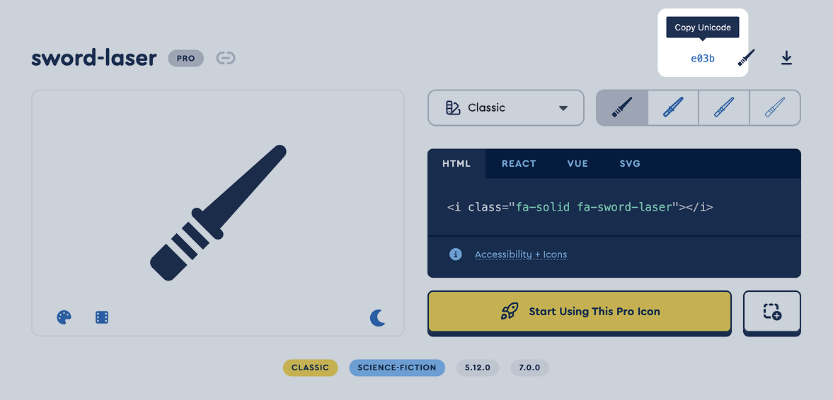 Screenshot of the Font Awesome website with the Unicode value highlighted
There are a few important items to include when referencing any individual icon:
- Set the pseudo-element to match the
::beforeyou used in the previous common set up step. - Set the
fontCSS property to the correct CSS custom property (see the Family and Styles Cheat Sheet below). But note that Duotones need special treatment. - Set the content to the Unicode value of one of our icons.
We don't recommend creating your own classes that start with fa- as it can result in missing icons or other unwanted behavior. You can add any other custom classes to your elements though!
/* Step 1: Basic styling for all icons - we did this in the first step above but it's included here for the full demo */
.icon::before {
  display: inline-block;
  text-rendering: auto;
  -webkit-font-smoothing: antialiased;
}

/* Step 2: Reference Individual Icons */
/* Make sure to include the correct font declaration and unicode value for the icon you want to add */

/* any HTML element with the "ghost" class will render fa-ghost icon in the Classic Solid style */
.ghost::before {
  /* Set the font to Solid */
  font: var(--fa-font-solid);
  /* Set the Unicode value for the "fa-ghost" icon */
  content: '\f6e2';
}

/* any HTML element with the "delete" class will render fa-trash icon in the Sharp Solid style */
.delete::before {
  /* Set the font to Sharp Solid */
  font: var(--fa-font-sharp-solid);
  /* Set the Unicode value for the "fa-trash" icon */
  content: '\f1f8';
}

/* any HTML element with the "custom-icon" class to render a custom icon (uploaded to a Kit) */
.custom-icon::before {
  font-family: 'Font Awesome Kit'; /* note that you need to use "font-family" for custom icons */
  content: '\[CUSTOM*ICON_UNICODE]'; /* replace with custom icon's unicode value \*/
}
And here's the HTML would look like to render those icons:
<span class="icon ghost">I ain't afraid!</span>
<span class="icon delete">Trash it... Or recycle!</span>
<span class="icon custom-icon">Something so special!</span>
Need a more hands-on example of how to do this? Here's a Codepen demo of all styles via CSS Pseudo-elements with our Web Fonts-based Framework.
If You Can Only Make Changes Using CSS
Sometimes you only have access to a project's CSS, but not its HTML. In that case, you can use the same strategy, but instead of creating your own icon class, you use classes from the existing HTML.
Let's say you want to add a trash icon to a delete button. The button has a class of delete and is inside a form with an ID of user-settings. You can use these to create a selector to match the HTML and then use the declarations to set the icon like we used above:
#user-settings .delete::before {
  display: inline-block;
  text-rendering: auto;
  -webkit-font-smoothing: antialiased;
  font: var(--fa-font-sharp-solid);
  content: '\f1f8';
}
CSS Pseudo-elements and Duotone
Using CSS pseudo-elements to render any duotone icons (like the Duotone or Sharp Duotone Pro families or Jelly Duo, Thumbprint or other duotone Pro+ families) follows a similar setup, but requires the use of both the ::before AND ::after pseudo-elements along with more styling setup.
1. Define Common CSS for Duotone Icons
There are shared CSS properties unique to the Duotone and Sharp Duotone styles that all duotone icons will need. Again, it's best to set up a shared CSS rule for all duotone icons first to simplify your individual icon definitions.
- Add styling to elements that will contain the pseudo-element to support positioning.
- Set the
fontto the CSS Custom Property, add the necessary font-style resets, and add positioning styles for the pseudo-element. - Set the default opacity levels and colors for each layer of the duotone icon.
/* Step 1: Common Duotone positioning properties required render the icons */
.icon-duotone {
  position: relative;
  padding-left: 1.25em; /* Make space for the absolutely positioned icon */
}

/* Step 2: Set the font styles for Duotone */
.icon-duotone::before,
.icon-duotone::after {
  font: var(--fa-font-duotone);

  /* Include the basic Font Awesome font style settings if you haven't already */
  display: inline-block;
  text-rendering: auto;
  -webkit-font-smoothing: antialiased;

  /* Position both layers of the icon to the left, set our fixed-width width,
     horizontally center layers, and then vertically align them so they flex
     with different line heights */
  position: absolute;
  left: 0;
  top: 50%;
  transform: translateY(-50%);
  width: 1.25em;
  text-align: center;
}

.custom-icon-duotone::before,
.custom-icon-duotone::after {
  /* note that you need to use "font-family" and "font weight" for custom icons */
  font-family: 'Font Awesome Kit Duotone';
  font-weight: 400;
}

/* Step 3: Set the default opacity levels and colors for each layer */
.icon-duotone::before {
  color: var(--fa-primary-color, inherit);
  opacity: var(--fa-primary-opacity, 1);
}

.icon-duotone::after {
  color: var(--fa-secondary-color, inherit);
  opacity: var(--fa-secondary-opacity, 0.4);
  font-feature-settings: 'ss01'; /* This will enable the second layer */
}
If you're using Sharp Duotone icons, you use the same CSS rules, except you change the font to font: var(--fa-font-sharp-duotone);.
2. Reference Individual Icon's Layers
Referencing individual duotone icons works much like other CSS pseudo-element icons, with the addition of setting the ::after pseudo-element to the icon's unicode value as well. So both pseudo-elements receive the same unicode value, and we use font-feature-settings: "ss01" that we set previously on .icon-duotone::after to render the second layer.
/* Step 4: Reference both duotone layers with the same unicode
   value, in this case the door-open icon. */
.icon-login::before,
.icon-login::after {
  content: '\f52b';
}

.custom-icon-duotone::before,
.custom-icon-duotone::after {
  content: '\[CUSTOM*ICON_UNICODE]'; /* Replace with custom icon's unicode value */
}
If you prefer, the old way of repeating the unicode value will still work. When you use this method, you don't need the font-feature-settings: "ss01" rule in your CSS.
/* The second layer will also be trigged by repeating the unicode value.
   Note that you don't need to set `font-feature-settings: "ss01"` on
   the `::after` pseudo-element for this to work. */
.icon-login::before {
  content: '\f52b';
}

.icon-login::after {
  content: '\f52b\f52b';
}
And here's the HTML would look like to render those icons:
<button class="icon-duotone icon-login">Login</button>
Need a more hands-on example of how to do this? Here's a Codepen demo render icons of all styles via CSS Pseudo-elements with our Web Fonts-based Framework.
Icon Families and Styles Cheat Sheet
Here's a handy chart, organized by Icon Packs, of the font styles/weights you can use in your pseudo element CSS rules to define the family and style of icon you want to use.
Classic
| Style | Availability | font-family | font-weight | CSS Custom Property |
|---|---|---|---|---|
| Solid | Free or Pro | Font Awesome 7 FreeFont Awesome 7 Pro | 900 |
--fa-font-solid |
| Regular | Free or Pro | Font Awesome 7 FreeFont Awesome 7 Pro | 400 |
--fa-font-regular |
| Light | Pro only | Font Awesome 7 Pro | 300 |
--fa-font-light |
| Thin | Pro only | Font Awesome 7 Pro | 100 |
--fa-font-thin |
Duotone
| Style | Availability | font-family | font-weight | CSS Custom Property |
|---|---|---|---|---|
| Solid | Pro only | Font Awesome 7 Duotone | 900 |
--fa-font-duotone |
| Regular | Pro only | Font Awesome 7 Duotone | 400 |
--fa-font-duotone-regular |
| Light | Pro only | Font Awesome 7 Duotone | 300 |
--fa-font-duotone-light |
| Thin | Pro only | Font Awesome 7 Duotone | 100 |
--fa-font-duotone-thin |
Sharp
| Style | Availability | font-family | font-weight | CSS Custom Property |
|---|---|---|---|---|
| Solid | Pro only | Font Awesome 7 Sharp | 900 |
--fa-font-sharp-solid |
| Regular | Pro only | Font Awesome 7 Sharp | 400 |
--fa-font-sharp-regular |
| Light | Pro only | Font Awesome 7 Sharp | 300 |
--fa-font-sharp-light |
| Thin | Pro only | Font Awesome 7 Sharp | 100 |
--fa-font-sharp-thin |
Sharp Duotone
| Style | Availability | font-family | font-weight | CSS Custom Property |
|---|---|---|---|---|
| Solid | Pro only | Font Awesome 7 Sharp Duotone | 900 |
--fa-font-sharp-duotone-solid |
| Regular | Pro only | Font Awesome 7 Sharp Duotone | 400 |
--fa-font-sharp-duotone-regular |
| Light | Pro only | Font Awesome 7 Sharp Duotone | 300 |
--fa-font-sharp-duotone-light |
| Thin | Pro only | Font Awesome 7 Sharp Duotone | 100 |
--fa-font-sharp-duotone-thin |
Brands
| Style | Availability | font-family | font-weight | CSS Custom Property |
|---|---|---|---|---|
| Brands | Free | Font Awesome 7 Brands | 400 |
--fa-font-brands |
Chisel
| Style | Availability | font-family | font-weight | CSS Custom Property |
|---|---|---|---|---|
| Regular | Pro+ only | Font Awesome 7 Chisel | 400 |
--fa-font-chisel-regular |
Etch
| Style | Availability | font-family | font-weight | CSS Custom Property |
|---|---|---|---|---|
| Solid | Pro+ only | Font Awesome 7 Etch | 900 |
--fa-font-etch-solid |
Graphite
| Style | Availability | font-family | font-weight | CSS Custom Property |
|---|---|---|---|---|
| Thin | Pro+ only | Font Awesome 7 Graphite | 100 |
--fa-font-graphite-thin |
Jelly
| Style | Availability | font-family | font-weight | CSS Custom Property |
|---|---|---|---|---|
| Regular | Pro+ only | Font Awesome 7 Jelly | 400 |
--fa-font-jelly-regular |
| Fill Regular | Pro+ only | Font Awesome 7 Jelly Fill | 400 |
--fa-font-jelly-fill-regular |
| Duo Regular | Pro+ only | Font Awesome 7 Jelly Duo | 400 |
--fa-font-jelly-duo-regular |
Mosaic
| Style | Availability | font-family | font-weight | CSS Custom Property |
|---|---|---|---|---|
| Solid | Pro+ only | Font Awesome 7 Mosaic | 900 |
--fa-font-mosaic-solid |
Notdog
| Style | Availability | font-family | font-weight | CSS Custom Property |
|---|---|---|---|---|
| Solid | Pro+ only | Font Awesome 7 Notdog | 900 |
--fa-font-notdog-solid |
| Duo Solid | Pro+ only | Font Awesome 7 Notdog Duo | 900 |
--fa-font-notdog-duo-solid |
Pixel
| Style | Availability | font-family | font-weight | CSS Custom Property |
|---|---|---|---|---|
| Regular | Pro+ only | Font Awesome 7 Pixel | 400 |
--fa-font-pixel-regular |
Slab
| Style | Availability | font-family | font-weight | CSS Custom Property |
|---|---|---|---|---|
| Regular | Pro+ only | Font Awesome 7 Slab | 400 |
--fa-font-slab-regular |
| Press Regular | Pro+ only | Font Awesome 7 Slab Press | 400 |
--fa-font-slab-press-regular |
| Duo Regular | Pro+ only | Font Awesome 7 Slab Duo | 400 |
--fa-font-slab-duo-regular |
| Press Duo Regular | Pro+ only | Font Awesome 7 Slab Press Duo | 400 |
--fa-font-slab-press-duo-regular |
Thumbprint
| Style | Availability | font-family | font-weight | CSS Custom Property |
|---|---|---|---|---|
| Light | Pro+ only | Font Awesome 7 Thumbprint | 300 |
--fa-font-thumbprint-light |
Utility
| Style | Availability | font-family | font-weight | CSS Custom Property |
|---|---|---|---|---|
| Semibold | Pro+ only | Font Awesome 7 Utility | 600 |
--fa-font-utility-semibold |
| Fill Semibold | Pro+ only | Font Awesome 7 Utility Fill | 600 |
--fa-font-utility-fill-semibold |
| Duo Semibold | Pro+ only | Font Awesome 7 Utility Duo | 600 |
--fa-font-utility-duo-semibold |
Vellum
| Style | Availability | font-family | font-weight | CSS Custom Property |
|---|---|---|---|---|
| Solid | Pro+ only | Font Awesome 7 Vellum | 900 |
--fa-font-vellum-solid |
Whiteboard
| Style | Availability | font-family | font-weight | CSS Custom Property |
|---|---|---|---|---|
| Semibold | Pro+ only | Font Awesome 7 Whiteboard | 600 |
--fa-font-whiteboard-semibold |
Custom Icons in a Kit
If you're using a Font Awesome Kit and have added custom icons, you can use these settings when adding icons as pseudo-elements.
| Style | Availability | font-family | font-weight | CSS Custom Property |
|---|---|---|---|---|
| Custom Icons | Pro Kits only | Font Awesome Kit |
400 |
--fa-font-kit |
| Custom Duotone Icons | Pro Kits only | Font Awesome Kit Duotone |
400 |
--fa-font-kit-duotone |
CSS Pseudo-elements with Our SVG+JS Framework
If you're using our SVG + JS framework to render icons, you need to do a few extra things:
Enable Pseudo-elements
Using CSS pseudo-elements to render icons is disabled by default when using our SVG + JS Framework. You'll need to add the data-search-pseudo-elements attribute to the <script> element that calls the main fontawesome.js file.
It might look something like this:
<html>
  <head>
    <title>My Project</title>

    <!-- include the core fontawesome.js file -->
    <script data-search-pseudo-elements defer src="/your-path-to-fontawesome/js/fontawesome.js"></script>
  </head>
</html>
This tells our script to look for pseudo-elements when identifying elements to turn into icons.
Set Pseudo-elements Display to "none"
Since our JS will find each pseudo-element icon reference and insert an icon into your page's DOM automatically, we'll need to hide the real CSS-created pseudo-element that's rendered.
<html>
  <head>
    <!-- include the core fontawesome.js file -->
    <script data-search-pseudo-elements defer src="/your-path-to-fontawesome/js/fontawesome.js"></script>

    <!-- include the files for any icon styles you plan to use in your project -->
    <script defer src="/your-path-to-fontawesome/js/solid.js"></script>
    <script defer src="/your-path-to-fontawesome/js/brands.js"></script>

    <style>
      /* Hide the CSS pseudo element */
      .icon::before {
        display: none;
      }

      /* Reference individual icons you want to show in your project */
      .login::before {
        /* Select the style you want the icon in */
        font: var(--fa-font-solid);
        /* Add the unicode for the specific icon you want to add - in this case it's the fa-user icon */
        content: '\f007';
      }

      /* Another example, this one is the fa-newspaper icon in the Sharp Solid style */
      .tps::before {
        font: var(--fa-font-sharp-solid);
        content: '\f1ea';
      }
    </style>
  </head>
  <body>
    <ul style="margin: 0;">
      <li><span class="icon login"></span> Login</li>
      <li><span class="icon tps"></span> TPS Reports</li>
    </ul>
  </body>
</html>
We know this can be tough to get. Here's a Codepen demo showing how to render icons via CSS Pseudo-elements with our SVG + JS Framework.
CSS Pseudo-elements with Sass
Interested in using Font Awesome icons as pseudo-elements in Sass/SCSS? We've got you covered - Check out the Add Icons as Pseudo-elements with Sass/SCSS doc.
Related Topics
CSS Pseudo-elements
Use a Custom Icon as a CSS Pseudo-element with Webfont Kit Upload