The Icon Wizard 2.0
Stack, blend, and combine Font Awesome icons into a single custom creation.
The Icon Wizard is a visual editor that lets you stack and combine Font Awesome icons into a single custom icon. Each icon you add is a layer you can position, scale, rotate, and blend with the layers below it. When you have something you like, subscribers can save it to one of their Kits as a custom icon.
The Icon Wizard is a beta feature!
We're still polishing things up, so you may run into a few rough edges. Let us know what you think, or report a bug.Visit fontawesome.com/icons/wizard to launch the Icon Wizard directly, or click the Icon Wizard button on any icon detail page to start with that icon already on the canvas.
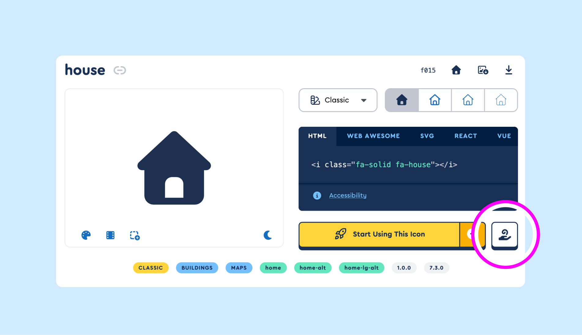 Launch the Icon Wizard straight from any icon's detail page.
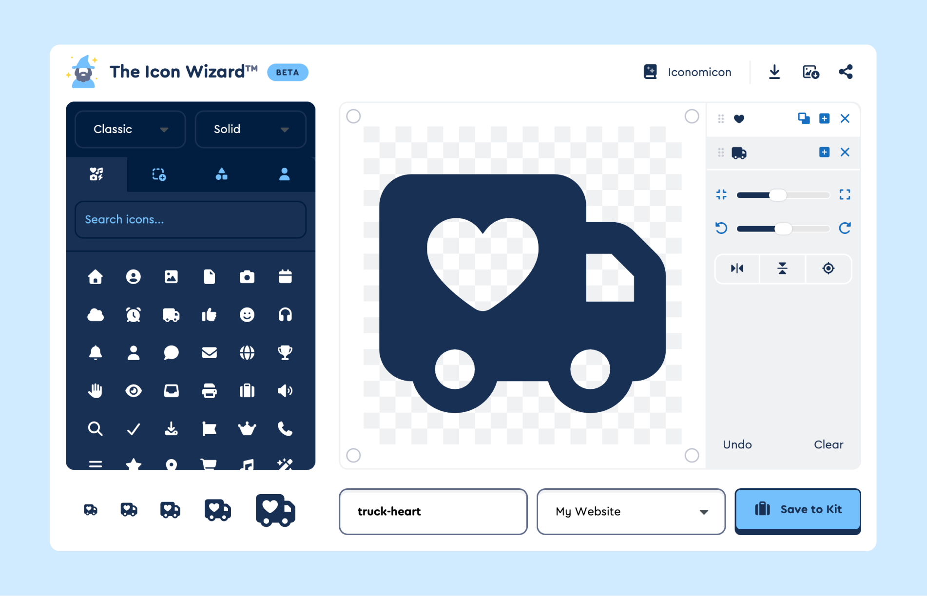 The Icon Wizard: conjure custom icons, no spellbook required.
Adding Layers
There are four ways to pick something to add to the canvas.
Icons
Browse the full Font Awesome catalog and filter by family and style. Click any icon to add it as a new layer on top of the canvas.
The full catalog is available with a paid subscription. Free accounts can play with a limited selection, but saving to a Kit and downloading require a paid plan.
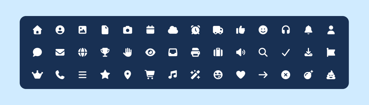 Icons: the full Font Awesome catalog.
Modifiers
A curated set of decorative shapes (badges, slashes, frames, etc.) that work well as overlays on a base icon. Modifiers automatically position themselves into the bottom-right corner of the canvas and use a cutout blend by default. You can still reposition, resize, and switch blend methods afterward.
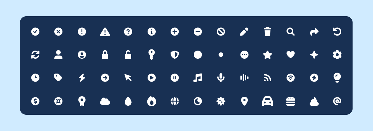 Modifiers: badges, slashes, frames, and more.
Elements
Geometric primitives like circles, squares, triangles, and lines. Useful when you want to draw on top of an icon (an arrow, a divider) without picking a specific icon to do it. Elements default to a full-canvas size so you can scale them down into the corner or shape you want.
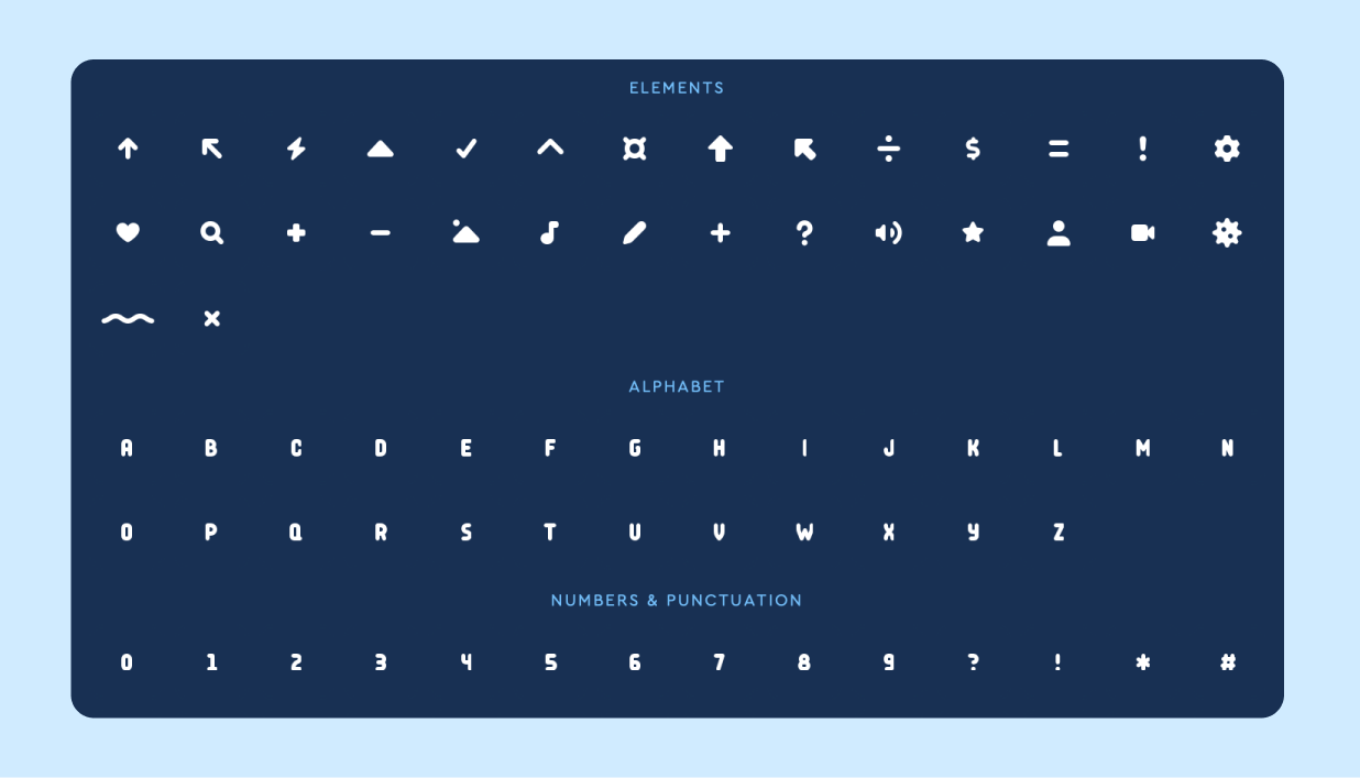 Elements: shapes, letters, and numbers.
User Blender
A library of user icon parts (heads and bodies) you can drop in as a single layer.
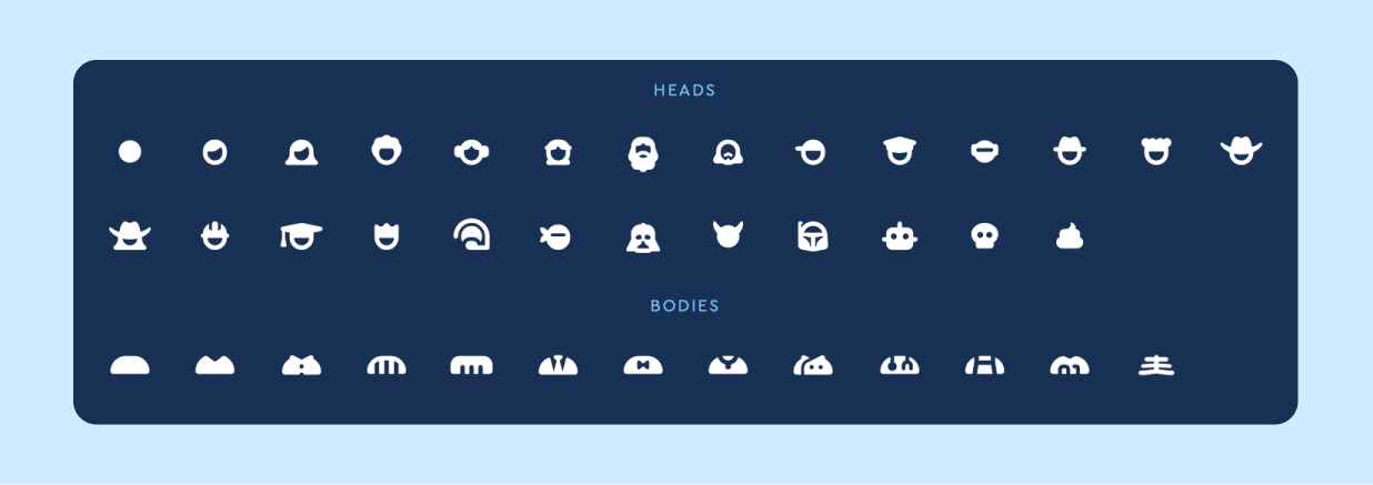 User Blender: mix-and-match heads and bodies.
Building an icon
- Pick something from a chooser tab. It's added as a new layer at the top of the canvas with default size and centered position.
- Select the layer in the layer tray (or click it on the canvas) to show its controls.
- Position, scale, and rotate using the sliders. The corner-snap buttons jump the selected layer to one of the four corners, handy for badges and modifiers. Keyboard shortcuts (see below) let you nudge in small steps for precise alignment.
- Pick a blend method by clicking the method button on the layer
row:
- Add: combines the new layer with the layers below, drawing its shape on top.
- Subtract: cuts the new layer's shape out of the layers below.
- Stroke: like Add, but leaves a transparent gap around the new layer where it meets the layers below. Good for badges that need a little visual breathing room.
- Reorder by dragging layer rows in the tray. The top of the tray is the visual top of the canvas.
- Duplicate makes a copy of the selected layer.
- Remove deletes a layer. If you want to start over with a blank canvas, hit the Clear button.
A note on legibility
Every icon, modifier, element, and User Blender piece is designed to look its best at its original size. When you resize, rotate, or combine full-size icons, we can't guarantee the result stays legible, especially at smaller sizes. The size previews below the canvas show how it holds up as you build.Saving to a Kit
Underneath the canvas, the Save to Kit panel shows up for subscribers. Pick a name (lowercase letters, numbers, and hyphens only), pick a Kit from the dropdown, then click Save to Kit. The icon shows up in your Kit's custom icons and is immediately usable in any project that uses that Kit.
A few rules:
- The Kit dropdown only lists your paid v7 Kits. Free Kits and older Kits don't appear.
- The default name is your layers' icon names joined with hyphens
(
heart-plus-circle), but you can override it. Names must be unique within the Kit. - Your Kit's package republishes automatically after you save.
Using your saved icon
Your icon shows up in your Kit's Custom Icons and works just like any other uploaded icon: reference it with the fa-kit prefix, style it with the usual sizing, coloring, transforms, and layering, and use it as a pseudo-element.
<i class="fa-kit fa-truck-heart"></i>
Need a different name? Rename it from your Kit's Custom Icons anytime after saving. Just don't change the name or style directly in your code, which breaks the reference.
Downloading
The Download SVG and Download PNG buttons in the top-right of the modal export the flattened composition as a single file. The PNG is black-on-transparent at the canvas's combined width and height.
Sharing
The Share button in the top-right creates a public landing page with your composition. See Sharing your creation for details.
Keyboard shortcuts
When the Icon Wizard modal is open and you have a layer selected:
| Key | Action |
|---|---|
| Arrow keys | Nudge the selected layer |
| Shift + Arrow keys | Nudge by a larger step |
+ / = |
Grow the selected layer |
- |
Shrink the selected layer |
0 |
Reset the selected layer's size |
H / V |
Flip horizontally / vertically |
C |
Center the selected layer |
Alt + Tab |
Cycle through your layers |
⌘Z / Ctrl + Z |
Undo |
Delete / Backspace |
Remove the selected layer |
Escape |
Close the Icon Wizard |
While using the Icon Wizard, open the Spellbook to view all the shortcuts.
Troubleshooting
The Save button is greyed out. The Wizard needs three things before it can save: a name for your icon, a Kit to save it into, and at least one layer on the canvas.
I clicked Download and got an upgrade prompt. Downloading requires a plan that includes icon downloads. Cloud-only subscriptions can save and use Wizard icons through a Kit, but can't download them as files. Upgrade to a plan with downloads to unlock the buttons.
I pressed Escape and the whole thing closed. Escape closes whatever's on top first. So if you've got the Share window open, the first press tucks that away and leaves the Wizard running. Press it again to close the Wizard itself.
My layers changed when I switched families in the chooser. They didn't, actually! Switching families only changes what you see in the chooser. The layers already on your canvas keep whatever style they had when you added them. That's by design, so you can freely mix and match styles in a single creation.
I don't see the Icon Wizard button on an icon's page. The Icon Wizard doesn't support the Brands family, so the button doesn't appear on brand logos. It shows up on every other icon.